Creating a report tab
In Page Report Studio, you can create a new report tab based on a predefined business/report cube to the current page report. You can also create a new page report containing one report tab and then add report tabs to it. However, the reports created on business/report cubes in Page Report Studio cannot be edited in JReport Designer any further.
To create a report tab:
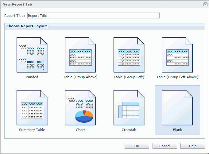
- In a Page Report Studio window, click Menu > File > New Page Report Tab (or the button
 on the Standard toolbar) to display the New Report Tab dialog. See the dialog.
If you click Menu > File > New Page Report, the New Page Report dialog appears for you to create a page report with the first report tab in it.
- Specify the title of the report tab as required in the Report Title text box.
- In the Choose Report Layout box, select the required layout with which you want to create the report tab.
- Click OK to create the report tab.
- If Blank is selected as the layout, a report tab which is blank will be created. You can then use the Toolbox and the Resource View panels to add objects and cube elements to the report tab.
- If you select the layout as Banded, Table, Chart, or Crosstab, the corresponding report wizard will then be displayed. Specify the settings according to your requirements.
Also, on the JReport Console > Resources page, you can directly create a new page report (containing a report tab) in a folder into which one or more catalogs containing some business/report cubes have been published. To do this:
- Open the folder and select the catalog for the new page report from the Catalog drop-down list.
- On the task bar of the Resources page, click New > Report.
- In the Select Report Type dialog, check the option Page Report and click OK.
- In the New Page Report dialog, create the page report containing a report tab as required.
The following topics show in detail how to create a report tab from a particular layout:
Creating a banded report
A banded object is a kind of component that can present grouped data and detailed data, and is composed of several banded panels with which you can easily organize data fields and other elements.
To create a banded report:
- In the New Report Tab dialog, specify the title of the report tab in the Report Title text box, select Banded as the layout and click OK to display the Banded Wizard.
- In the Data screen, select the business/report cube in the current catalog, on which the banded object will be built.
- In the Display screen, add the required fields from the Resources box to be displayed in the banded object. Modify the display name of any added field if necessary.
- In the Group screen, add the dimension objects
 as the grouping criteria, then specify the sorting direction of each group in the Sort column.
- To add summaries, go to the Summary screen. Select the group to which the summary will be applied, then add a measure object
 as the summary field.
- In the Query Filter screen, specify the filter you want to apply to the business/report cube.
- In the Style screen, apply a style to the banded object.
- Click Finish to create the report.
Creating a table report
Tables give you great control over how to present data, including placing fields, grouping them, and sorting them. A table is composed of row and columns, and each contains several cells. With such a structure a table is a good way to show any two-dimensional dataset.
To create a table report:
- In the New Report Tab dialog, specify the title of the report tab in the Report Title text box, select the desired table type in the Choose Report Layout box, then click OK to display the Table Wizard.
- Table (Group Above)
Creates a table with group information above the detail panel.
- Table (Group Left)
Creates a table with group information left to the detail panel.
- Table (Group Left Above)
Creates a table with group information left above the detail panel.
- Summary Table
Creates a table with only group and summary information.
- In the Data screen, select the business/report cube in the current catalog, on which the table will be built.
- In the Display screen, add the required fields from the Resources box to be displayed in the table. Modify the display name of any added field if necessary.
- In the Group screen, add the dimension objects as the grouping criteria, then specify the sorting direction of each group in the Sort column.
- To add summaries, go to the Summary screen. Select the group to which the summary will be applied, then add a measure object as the summary field. For the Group Left table, you can use the Row and Column columns to control the position of the summary field in the table.
- In the Query Filter screen, specify the filter you want to apply to the business/report cube.
- In the Style screen, apply a style to the table.
- Click Finish to create the report.
Creating a crosstab report
A crosstab summarizes data and presents the summaries in a compact row and column format.
To create a crosstab report:
- In the New Report Tab dialog, specify the title of the report tab in the Report Title text box, select Crosstab as the layout and click OK to display the Crosstab Wizard.
- In the Data screen, select the business/report cube in the current catalog, on which the crosstab will be built.
- In the Display screen, select a dimension object and click
 or
or  to add it to the Columns or Rows box as a group field. Select a measure object and click
  to add it to the Summaries box as an aggregate field. Repeat this to add more group/aggregate fields.
- In the Display Name column, edit the display names of the added group fields or aggregate fields if required. These will label the rows, columns and summaries when the report is displayed. By default these are blank and no labels will be created.
- In the Sort column, specify the sorting manner for the group fields.
- If you want to remove any group/aggregate field, select it and click
 . To adjust the order of the group/aggregate fields, select a group/aggregate field and click
  or
or  .
.
- In the Query Filter screen, specify the filter you want to apply to the business/report cube.
- In the Style screen, apply a style to the crosstab.
- Click Finish to create the report.
Creating a chart report
A chart organizes and graphically presents data in a way that makes it easy for end users to see comparisons, trends, and patterns in data. It represents the report data in a visually straightforward form. A chart is based on the chart platform. On the platform, the chart paper, the legend, and labels make up the chart. You can create a chart that contains only simple DBFields, or a complicated chart that contains DBFields, groups, summaries, and even formulas. Normally, DBFields, summaries, and formulas in a report are represented in a chart using chart data markers, and groups are used to produce category names and data series names. DBFields can also be used as category names.
For details about the chart types JReport supports, see Chart types in the JReport Designer User's Guide.
For how charts present data, see How data is represented in a chart in the JReport Designer User's Guide.
For the elements that compose a chart, see Chart elements in the JReport Designer User's Guide.
To create a chart report:
- In the New Report Tab dialog, specify the title of the report tab in the Report Title text box, select Chart as the layout and click OK to display the Chart Wizard.
- In the Data screen, select the business/report cube in the current catalog, on which the chart will be built.
- In the Type screen, specify the chart type as required.
A default chart type exists in the Chart Type Groups box. To replace it with another one, select a chart type from the Chart Type box. The thumbnails of the subtypes in this type will then be displayed in the Subtype box. Select the required subtype to replace the default chart type.
If you want to create a combo chart, click <Add Combo Type> of Primary Axis or Secondary Axis in the Chart Type Groups box, and an additional subtype will be added. To replace the additional subtype, select it, then specify the required type and subtype respectively in the Chart Type and Sub Type boxes.
To add more subtypes, repeat the procedures. To remove a subtype, select it and click .
- In the Display screen, select a dimension object in the Resources box and add it to the Category or Series box, the data of which will be displayed on the corresponding axis. Select a subtype in the Show Values box, then add a measure object or an additional value
 as the data of the subtype.
To add an additional value to a subtype:
- Select the subtype in the Show Values box.
- In the Resources box, expand the Additional Values node, then select Constant Value/Average Value.
- Click beside the Show Values box. The Edit Additional Value dialog appears.
- In the Name text box, specify the display name for the constant/average value.
- Input the constant value with numeric type in the Value text box, or select a field based on which the average value will be calculated from the Based On drop-down list.
- Click OK, and the defined constant/average value will be added to the subtype.
If you want to further modify a constant/average value, select the value in the Show Values box, then click  . In the Edit Additional Value dialog, edit the value as required.
You can add more than one measure object or additional value to a subtype. Each added subtype shall have at least one measure object or additional value.
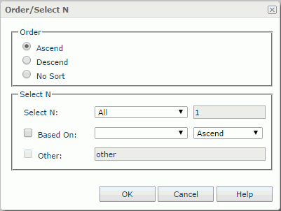
- If you want to define the sort order and Select N condition on the category/series axis of the chart, click the Order/Select N button below the Category/Series box, then define the condition in the Order/Select N dialog.
To define a sort order and Select N condition on the category/series axis:
- In the Order box of the Order/Select N dialog, specify in which order values on the category/series axis will be sorted. See the dialog.
- In the Select N box, specify the Select N condition to All, Top or Bottom. If All is selected, all category/series values will be shown in the chart; if Top or Bottom is selected, the text field next to it will be enabled and you can specify an integer here, which means that the first or last N category/series values will be shown in the chart.
- Check the Based On checkbox and specify values for the two drop-down lists that follow according to your requirement.
If Based On is unchecked, the order of the first or last N category/series values will be based on what you specify in the Order box of the dialog; if you check it, the order will be based on values of the summary field and the sort direction you specify in the drop-down lists next to the Based On checkbox.
- If you have selected Top or Bottom from the Select N drop-down list, you can check the Other checkbox and the type a character string in the next text field, so that the category/series values beyond the first or last N range will be merged into the group with the name as that character string.
- Click OK to accept the settings.
- In the Query Filter screen, specify the filter you want to apply to the business/report cube.
- In the Style screen, apply a style to the chart.
- Click Finish to create the report.