Inserting objects into the panel
You can insert labels and web controls, which are used as variables, into the configuration panel. The web controls that can be inserted into the configuration panel of a library component are: text field, checkbox, drop-down list, and list.
Inserting a label
To insert a label into the configuration panel:
- Do one of the following to insert the label:
- Drag Label from the Toolbox panel to the destination.
- On the menu bar, click Insert > Label, then drag the label to the required destination.
- On the Insert toolbar, click the Insert Label button
 , then drag the label to the required destination.
- Double-click the label to edit the text.
Inserting a text field
To insert a text field into the configuration panel and define its web options:
-
Do one of the following to insert the text field:
- Drag Text Field from the Toolbox panel to the destination.
- On the menu bar, click Insert > Web Controls > Text Field, then drag the text field to the required destination.
- On the Insert toolbar, click the down arrow on the Insert Control Objects button
 and select Text Field from the drop-down list, then drag the text field to the required destination.
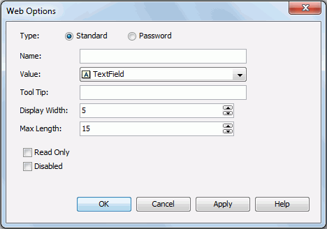
- Right-click the text field and select Web Options from the shortcut menu. The Web Options dialog displays. See the dialog.
- Select the type of the text field: Standard or Password.
Standard means that the text field will be a normal text field. Password means that the text field will be a password box in which the typed characters will be displayed as asterisks.
- Enter the name, value for the text field in the Name and Value fields.
- In the Tool Tip field, enter the tip you want to show for the text field. When the component is displayed in a dashboard, when you hover the mouse over the text field, the tooltip will be displayed.
- Set the character width in the Display Width field, and the maximum number of characters the user can enter in the Max Length field.
- Check the Read Only option if you would like to set this text field to be read-only.
- Check the Disabled checkbox if you want to make the text field disabled.
- Upon finishing, click the OK button to close this dialog.
Inserting a checkbox
To insert a checkbox into the configuration panel and define its web options:
-
Do one of the following to insert the checkbox:
- Drag Checkbox from the Toolbox panel to the destination.
- On the menu bar, click Insert > Web Controls > Checkbox, then drag the checkbox to the required destination.
- On the Insert toolbar, click the down arrow on the Insert Control Objects button and select Checkbox from the drop-down list, then drag the checkbox to the required destination.
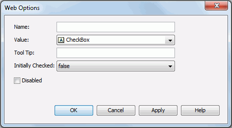
- Right-click the checkbox and select Web Options from the shortcut menu. The Web Options dialog displays. See the dialog.
- Specify the name, value of the checkbox in the Name and Value fields.
- In the Tool Tip field, enter the tip you want to show for the checkbox button. When the component is displayed in a dashboard, when you hover the mouse over the text field, the tooltip will be displayed.
- Set Initially Checked to true if you want the checkbox to be selected by default.
- Check the Disabled checkbox if you want to make the checkbox disabled.
- Upon finishing, click OK to close this dialog.
Inserting a list/drop-down list
List and drop-down list are generally called multivalue containers. A list or drop-down list provides a list of values for users to select from. A drop-down list occupies a smaller space than a list box so that the configuration panel can be laid out more compactly.
To insert a list/drop-down list into the configuration panel and define its web options:
-
Do one of the following to insert the list/drop-down list:
- Drag List/Drop-down List from the Toolbox panel to the destination.
- On the menu bar, click Insert > Web Controls > List/Drop-down List , then drag the list/drop-down list to the required destination.
- On the Insert toolbar, click the down arrow on the Insert Control Objects button and select List/Drop-down List from the drop-down list, then drag the list/drop-down list to the required destination.
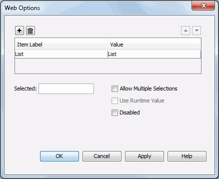
- Right-click the list/drop-down list and select Web Options from the shortcut menu. The Web Options dialog displays. See the dialog.
- Specify the item labels and the value of each item in the items box by inputting some strings as the labels and values respectively.
If you want to use a DBField/formula field/parameter field to control the value, click  in the Value column to insert one with the Insert Fields dialog, and then select the format for the inserted field from the drop-down list in the Item Label column. Check the All radio button in the Insert Field dialog if you want to add an All value to the list/drop-down list. Then when All is selected as value of the list/drop-down list at runtime, all filter actions defined on the list/drop-down list will not take effect, and if you applied some other web action that needs value from the list/drop-down list, a Null value will be returned.
- For a list web control, you can check the Allow Multiple Selections checkbox if you want to allow multiple items to be selected.
- In the Selected field, specify the selected value for the list/drop-down list.
- To use the runtime value as the selected value, check Use Runtime Value.
- If you want to disable the list/drop-down list, check the Disabled option.
- When done, click OK to apply the settings.
Note: If you have specified a tooltip for any web control, when the library component is opened in JDashboard, the tooltip of the web control will be displayed differently on different browsers:
- On Internet Explorer, the tip text will be automatically wrapped if its length exceeds the maximal tip width the browser allows. In addition, for Internet Explorer, you can manually add a new line by adding 
 or 
 ahead of the text when editing it in the Tool Tip field.
- On Firefox, the tip text will be displayed in one line with the maximal tip width the browser allows, and the text that cannot be displayed within the width will be cut off and replaced by ellipsis.