This dialog appears when you right-click a web control in the configuration panel of a library component and select Web Options from the shortcut menu. It helps you to define values of the web control and varies with the web control type.
OK
Accepts the changes and closes the dialog.
Cancel
Discards the changes and closes the dialog.
Apply
Applies all changes and leaves the dialog open.
Help
Displays the help document about this feature.
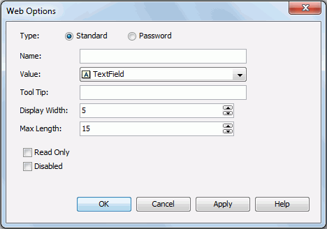
For a text field web control, options in the dialog are as follows. See the dialog.
Type
Specifies the type of the text field.
Name
Specifies the name of the text field.
Value
Specifies the value of the text field.
Tool Tip
Specifies the tooltip of the text field, which will be shown when you hover the mouse over the text field at runtime.
Display Width
Specifies the display width of the text field.
Max Length
Specifies the maximum length of the string that is allowed in the text field.
Read Only
Specifies whether to make the field read-only to others.
Disabled
Specifies whether the text field is disabled or enabled.
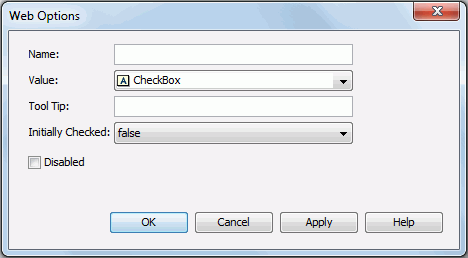
For a checkbox web control, options in the dialog are as follows. See the dialog.
Name
Specifies the name of checkbox.
Value
Specifies the value of the checkbox.
Tool Tip
Specifies the tooltip of the text field, which will be shown when you hover the mouse over the text field at runtime.
Initially Checked
Specifies whether or not the checkbox is selected by default.
Disabled
Specifies whether the checkbox is enabled or disabled.
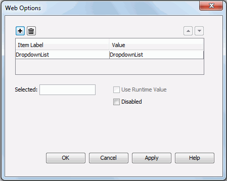
For a drop-down list web control, options in the dialog are as follows. See the dialog.

Adds a new item in the drop-down list.

Removes the selected item from the drop-down list.

Moves the selected item in the drop-down list up a step.

Moves the selected item in the drop-down list down a step.
Item Label
Specifies the display text or format of the item value.
Value
Specifies the item value. Type the value directly in the text box or click the button  next to it to open the Insert Fields dialog where you can add field to control the value.
Selected
Specifies the value that will be selected in the drop-down list by default.
Use Runtime Value
When changing the display type of a parameter to drop-down list, you can check this option to use the runtime value as the selected value of the drop-down list.
Disabled
Specifies whether the drop-down list is disabled or enabled.
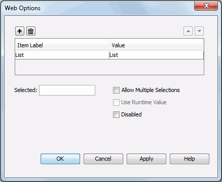
For a list web control, options in the dialog are as follows. See the dialog.
Adds a new item in the list.
Removes the selected item from the list.
Moves the selected item in the list up a step.
Moves the selected item in the list down a step.
Item Label
Specifies the display text or format of the item value.
Value
Specifies the item value. Type in the value directly in the text box or click the button next to it to open the Insert Fields dialog where you can add field to control the value.
Selected
Specifies the value that will be selected in the list by default.
Allow Multiple Selections
Specifies whether to allow selecting multiple items in the list at the same time.
Use Runtime Value
When changing the display type of a parameter to list, you can check this option to use the runtime value as the selected value of the list.
Disabled
Specifies whether the list is disabled or enabled.