

Track 2: Performing visual analysis
Visual Analysis is a WYSIWYG product to visualize the result of every step of your work. Simply by dragging and dropping data fields onto a layout module, you are able to visually create crosstabs and charts step by step.
Business views are the data sources used in Visual Analysis.
Note: A Visual Analysis license is required in order to perform this track. If you do not have the license, please contact your Jinfonet Software account manager to obtain one first.
Task 1: Select a business view
- On the JReport Console > Resources page, click New > Analysis on the task bar.
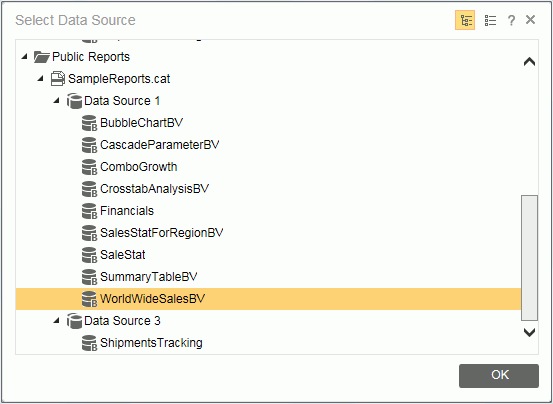
- The Select Data Source dialog lists all catalogs in the current folder and the business views in the catalogs. Click Public Reports > SampleReport.cat > Data Source 1 > WorldWideSalesBV, then click OK.
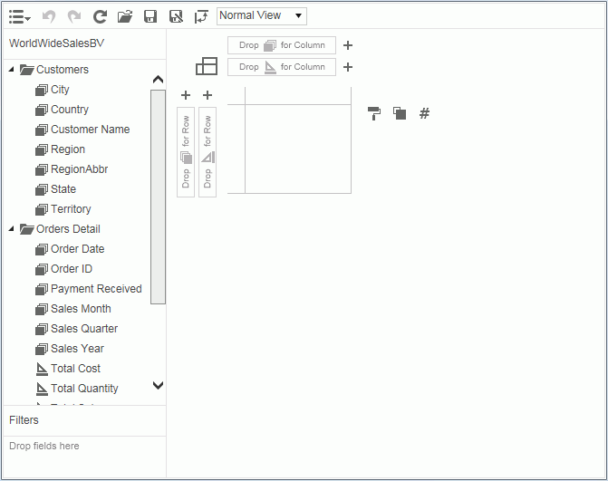
- The Visual Analysis window will be displayed.
Task 2: Adding data fields
This section demonstrates how to drag data fields to the data presentation area and how to use the legend buttons.
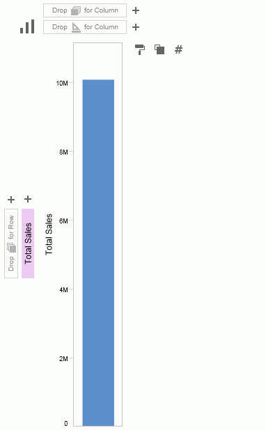
- In the Visual Analysis, click the Display Type button
 and then select Bar
  from the drop-down list.
- Drag Total Sales from the resources panel on the left to the row control box
 . The Total Sales field is used to draw the axis in the row header.
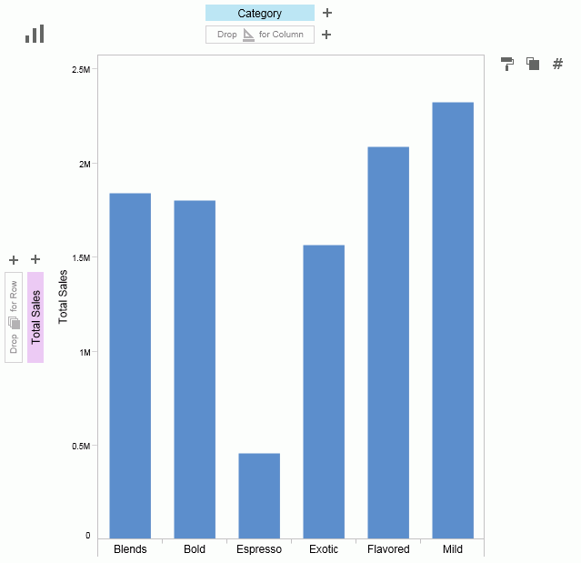
- Drag Category to the column control box
 as the column header.
- Drag Sales Year right to Category: when an arrow appears on the right, drop the field.
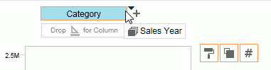
You can also make use of the  button to add a field from its drop-down resource list.
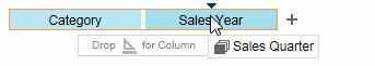
- To replace Sales Year with Sales Quarter, drag Sales Quarter over Sales Year. An arrow will appear above Sales Year (in the center), then drop Sales Quarter.
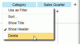
- To Remove Category, click on it and select Delete from the drop-down menu.
Or you can simply drag the
Category label out of its position to remove it.
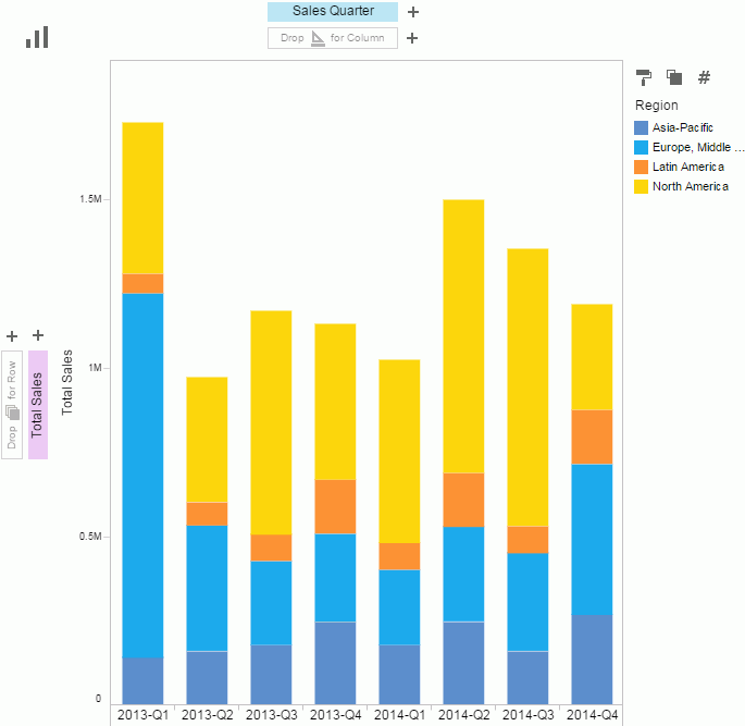
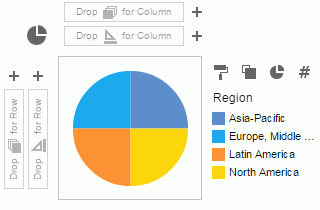
- To mark different regions by color, drag Region to the Color button
 in the legend section.
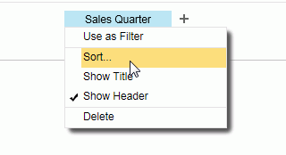
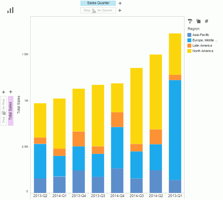
- We will sort sales quarters.
Click Sales Quarter and select Sort.
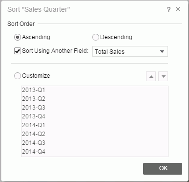
- In the Sort dialog,
check the Sort Using Another Field option, and then select Total Sales from the drop-down list.
Click OK.
- Here is the sort result.
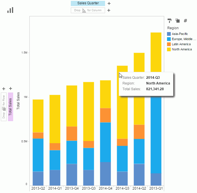
- Hover the cursor on a bar and you will see related information.
- Drag Sales Month after Sales Quarter.
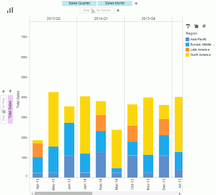
- The scrollbar shows and we cannot see the whole chart. Select Fit Visible from the drop-down list of
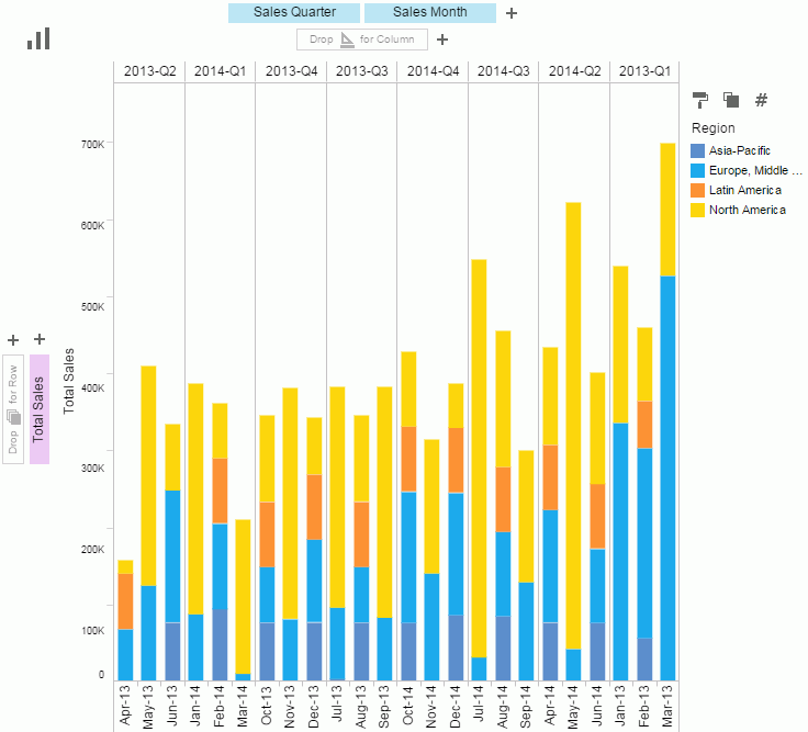
Normal View on the toolbar so that the bar is fully displayed according to the current space.
- Next we will use the Pie type to demonstrate the slice-by feature. Since a pie does not need as much space as the above bar, we will change Fit Visible back to Normal View on the toolbar.
- Click and then select
 from the drop-down list. Then remove Sales Quarter and Sales Month from the column header by dragging them out of their positions.
- Move Total Sales from the row header to be the slice-by field by moving it to the
 button in the legend section on the right. Slice-by decides the angle for the total sales in each region.
Task 3: Saving the template
The current data state can be saved as a template. Click  on the toolbar. In the Save As dialog, leave the save location be the My Reports folder, type in ProductSales in the File Name text box, and click OK. Next time we will be able to open the template in the My Reports folder in the server resource tree.
Task 4: Filtering the data
We will use the Text display type to show the filter feature.
- Click
 and then select New from the drop-down menu to start a new Visual Analysis session.
- In the Select Data Source dialog, select WorldWideSalesBV and click OK.
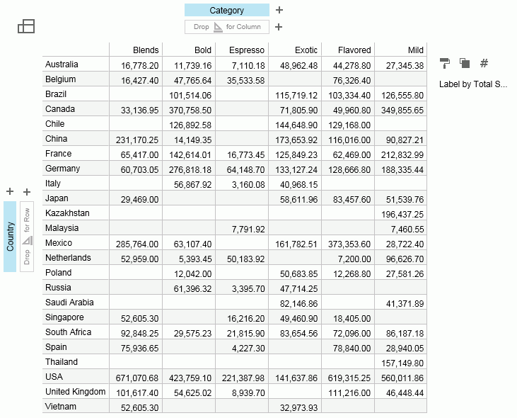
- From the resources panel, drag Country to the row header , Category to the column header , and Total Sales to the
 button in the legend section.
- From the resources panel drag Region to the Filters panel below. By default all the values are selected.
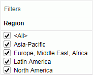
- To view the data in Asia-Pacific, uncheck <All> and then select Asia-Pacific. The data will be refreshed to show the countries in Asia-Pacific.
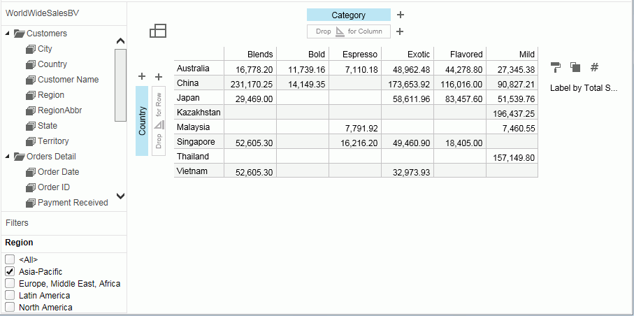
- Save the template as Sales-text in the My Reports folder.
Track 2 summary
In this track, we used Visual Analysis to add data dimensions step by step visually, saved the current data status as a template and filtered the data.