

The Visual Analysis window contains the following sections:
 Menu
Menu
In the Fit XXX mode, the column header height, row header width, and the header font size is the same as that in Normal View. The text in the header will be cut if it cannot be fully displayed.
 Undo
Undo
Undoes the last operation.
 Redo
Redo
Reverses the operation of Undo.
 Refresh
Refreshes the current data result.
 Open
Open
Opens an existing Visual Analysis template in a new Visual Analysis window via the Open dialog.
 Save
Save
Saves the changes made during the visual analysis.
 Save As
Saves the current Visual Analysis template with a different name or location in the Save As dialog.
 Swap
Swap
Exchanges the columns and rows in the data presentation area.
 View mode
Specifies the view mode from the drop-down list.
Resources panel
This panel lists all the fields in the selected business view. It provides data resources to the Filters panel and to the presentation area.
Filters panel
This panel lists the filters being used. You can add new filters by dragging group fields from the Resources panel into the Filters panel. The newly added filters provide full values by default.
This is where you perform visual analysis actions. Follow the instructions in this area to drag data fields from the Resources panel to the desired positions in the presentation area. As you start to drag a field, the possible places where you can drop it are highlighted with a red border. As you add groups to the rows or columns the crosstab expands to include the new group and all of the aggregations are recalculated.
Only group and aggregation fields can be added into the data presentation area.

The following are details about each element:
Drag a group field from the Resources panel and drop it to this control box, and it will become a column header. You can drag multiple data fields here one by one. When there are already existing fields here you can drop them in front or in back of each existing field. A black arrow appears to indicate the position it will take when you drop it.
You can also make use of the button  to add a new field. Click and select the required one from the drop-down list which is a filtered result of all the group fields in the business view. The field will be added as the rightmost column by default.
To adjust the order of the columns, drag one and drop it to a new location.
To remove a field from the column, drag and drop it outside of the control box, or click the field and then select Delete from the drop-down menu.

Drag an aggregation field from the Resources panel and drop it to this control box, and it will become a column header. The field is used to draw axes horizontally at the bottom. You can drag multiple data fields here one by one. When there are already existing fields here you can drop them in front or in back of each existing field. A black arrow appears to indicate the position it will take when you drop it.
You can also make use of the button to add a new field. Click and select the required one from the drop-down list which is a filtered result of all the aggregation fields in the business view. The field will be added as the rightmost column by default.
To remove a field from the column, drag and drop it outside of the control box, or click the field and then select Delete from the drop-down menu.
Drag a group field from the Resources panel and drop it to this control box, and it will become a row header. You can drag multiple data fields here one by one. When there are already existing fields here you can drop them above or below each existing field. A black arrow appears to indicate the position it will take when you drop it.
You can also make use of the button to add a new field. Click and select the required one from the drop-down list which is a filtered result of all the group fields in the business view. The field will be added as the topmost row by default.
To remove a field from the row, drag and drop it outside of the control box, or click the field and then select Delete from the drop-down menu.
Drag an aggregation field from the Resources panel and drop it to this control box, and it will become a row header. The field is used to draw axes vertically on the left. You can drag multiple data fields here one by one. When there are already existing fields here you can drop them above or below each existing field. A black arrow appears to indicate the position it will take when you drop it.
You can also make use of the button to add a new field. Click and select the required one from the drop-down list which is a filtered result of all the aggregation fields in the business view. The field will be added as the topmost row by default.
To remove a field from the row, drag and drop it outside of the control box, or click the field and then select Delete from the drop-down menu.
Specifies the display type of the data values displayed in the data presentation area.
 Text
Text
The data values are displayed in text. This type requires that a data field is defined by the label legend  in the legend section.
 Bar
Bar
The data values are displayed in bar chart.
 Line
Line
The data values are displayed in line chart.
 Pie
Pie
The data values are displayed in pie chart.
 Shape
Shape
The data values are displayed as shape diagrams.
This section introduces all available legend types. Some legend types are specific to certain display types.
The color legend  allows you to
identify the members of a data field by colors.
allows you to
identify the members of a data field by colors.
Data fields that can be bound with the color legend should be either of the following:
Multiple aggregation fields and the combination of group and aggregation fields are not supported.
For a single field, each field member is marked by a distinct color. For multiple group fields, each combination of the members of the fields is marked by a distinct color.
A color legend field can be moved to another legend. Drag the field to the corresponding legend button, or click the field name bar and select the proper item:
Adding data fields
To add a data field to the color legend, drag the field from the Resources panel and drop it to the Color button . The field and its members will be listed in the lower area of the Legend section. Each member will be marked by a distinct color.
If group fields are already added in the color legend, dragging an aggregation field to the color legend will remove all the existing group fields from the color legend.
If an aggregation field is already added in the color legend, dragging another group field or aggregation field to the color legend will remove the existing aggregation field from the color legend.
Replacing a data field
To replace a group field in the color legend with another group field, drag the new field and drop it to the existing field name in the color legend until the name bar is highlighted.
To replace an aggregation field with another aggregation field, drag the new field and drop it to the Color button or drop it to the existing field name in the color legend until the name bar is highlighted.
Changing the field order
When multiple group fields are bound with the color legend, you can change their order. By default the bound fields are listed from top to bottom. Drag a field that is not at the bottom of the list to the Color button and the field will be moved to the bottom of the list.
Removing a data field
To remove a data field from the color legend, drag and drop the field name bar outside of its position.
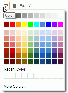
Customizing color when color legend is bound with no field
If no field is bound with the color legend, the color legend will use one single color.
Click the Color button and you will be able to select a color in the color palette, or click More Colors to select a color within a wider range.
Customizing color when color legend is bound with fields
If group fields are bound with the color legend, the colors will be discrete colors that come from a pattern. To change the color, click the Color button to access the Edit Color dialog.
If an aggregation field is bound with the color legend, the colors will be gradient colors which also come from a pattern. To change the color, click the Color button to access the Edit Gradient Color dialog.
 allows you to identify the members of a data field by sizes.
Drag a data field from the Resources panel and drop it to the Size button . The field will be listed in the lower area of the Legend section.
The size legend can be bound with at most one data field. Drag a different data field to the Size button which is already bound with a field, the new field will replace the existing field.
To remove the size legend field, drag and drop the field name bar outside of its position.
Click the Size button and you will be able to adjust the size legend in percentage. The range is from 1% to 200%.
The size legend field can be moved to another legend. Drag the field to the corresponding legend button, or click the field name bar and select the proper item:
The label legend provides label text to the members of data fields. Multiple data fields can be bound with the label legend.
A label legend field can be moved to another legend. Drag the field to the corresponding legend button, or click the field name bar and select the proper item:
Adding data fields
To add a data field to the label legend, drag the field from the Resources panel and drop it to the Label button . The field will be listed in the lower area of the legend section.
Replacing a data field
To replace a data field in the label legend with another data field, drag the new field and drop it to the Label button or drop it to the existing field name in the label legend until the name bar is highlighted.
Changing the field order
When multiple data fields are bound with the label legend, you can change their order. By default the bound fields are listed from top to bottom. Drag a field that is not at the bottom of the list to the Label button and the field will be moved to the bottom of the list.
Removing a data field
To remove a data field from the label legend, drag and drop the field name bar outside of its position.
The slice legend  allows you to
identify the members of an aggregation field by sections divided from the center point in pies. It is available to the Pie display type.
allows you to
identify the members of an aggregation field by sections divided from the center point in pies. It is available to the Pie display type.
The slice legend can be bound with at most one aggregation field. Drag an aggregation field from the Resources panel and drop it to the Slice button . The field will be listed in the lower area of the Legend section.
Drag a different aggregation field to the Slice button which is already bound with a field, the new field will replace the existing field.
To remove the slice legend field, drag and drop the field name bar outside of its position.
The slice legend field can be moved to another legend. Drag the field to the corresponding legend button, or click the field name bar and select the proper item:
The shape legend  allows you to identify the members of a data field by shapes. It is available to the Shape display type.
Drag a data field from the Resources panel and drop it to this button. The field will be listed in the lower area of the Legend section.
The shape legend can be bound with at most one data field. Drop a different data field to the Shape button which is already bound with a field, the new field will replace the existing field.
To remove the shape legend field, drag and drop the field name bar outside of its position.
The shape legend field can be moved to another legend. Drag the field to the corresponding legend button, or click the field name bar and select the proper item:
Customizing shape when color legend is bound with no field
If no field is bound with the shape legend, the shape legend will use one shape. To change the shape, click the Shape button and then select a shape from the drop-down list.
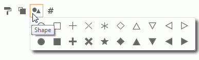
The first shape is the default applied shape.
Customizing shape when color legend is bound with a field
If a data field is bound with the shape legend, to change the shapes, click the Shape button to access the Edit Shapes dialog.