
Creating a motion chart
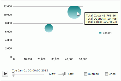
You can make a chart move at runtime based on the value changes of a specified motion field. This kind of chart is called motion chart. For a motion chart, a motion control section will be added on its platform, which contains the following elements:

- A play button allowing you to make the chart play its dynamic trend or to be static.
- A motion bar which contains a defined motion field. The chart will update its dynamic trend based on the value changes of the motion field.
- A speed control. The moving speed of the chart can be controlled by dragging the slider on the speed control.
- For a bubble chart, there is also a trail control, which allows you to make the chart show trails of bubbles or lines.
Currently, motion charts are supported on web reports and library components only.
To insert a motion chart into a web report or a library component:
- Position the mouse pointer at the destination where you want to insert the chart.
- Do one of the following to open the Create Chart wizard:
- Click Insert > Chart on the menu bar.
- Click the Insert Chart button
 on the Insert toolbar.
- Drag Chart from the Toolbox panel to the destination.
- In the Data screen of the wizard, select a business view in the current catalog on which the chart will be created.
- In the Type screen, specify the type of the chart which can only be single chart of bar, bench or bubble type.
- In the Display screen, specify a title for the chart in the Title text field. Add the required fields from the Resources box to be displayed on the category axis, series axis and value axis of the chart, and define some special group, special function and Order/Select N condition on the category/series field if required. You can also add additional values including constant values and average values to be displayed on the value axis of the chart.
If you select a bubble chart type, you need to specify the fields to be shown on its X axis, Y axis and the value you want to show as the bubble radius in the Show Values box. Note that when you specify a value for X axis, this value will be displayed on the category axis instead of the one specified in the Category box. However, the value defined in the Category box will be also be included in the data calculation.
Check the Motion Bar for Playable Chart checkbox, then from the Resources box add a field which is of Integer, Date or Time data type as the motion field. When the field is of the Date data type, you can define some special function on it.
- To apply some filters to the chart so as to reduce the data displayed in the chart, go to the Filter screen and define the filter conditions.
- In the Layout screen, specify the layout of the chart.
- In the Style screen, select a style for the chart.
- Click Finish to insert the chart.
When a motion chart is published to JReport Server, you can then run it in Web Report Studio or JDashboard. Then, you can use the motion control section to make the chart move. Click the play button and the chart will show its dynamic trend based on the value change of the motion field which is bound in the motion bar. To stop it, click the button again. You can also control its moving speed by dragging the slider between Slow and Fast on the speed control. For a bubble chart, you can control whether the chart will be moving in bubble or line trail.
Example of creating a motion chart
This example illustrates how to create a motion chart in a web report and play it in Web Report Studio.
- Open the catalog file SampleReports.cat.
- Click File > New > Web Report on the menu bar.
- Drag Chart from the Toolbox panel to the web report. The Create Chart wizard appears.
- In the Data screen of the wizard, select WorldWideSalesBV from Data Source 1. Then click Next.
- Select Bubble 2-D type in the Type screen.
- In the Display screen, add the field City to the Category box, then click the Order/Select N button. In the Category Options dialog, select Top N from the Select drop-down list, input 2 in the text field to the right, then click OK to return to the wizard.
- In the Show Values box, add the field Total Cost, Total Quantity and Total Sales respectively as the value of X Axis, Y Axis and Radius. Note that when you specify a value for X axis, this value is displayed as the category value instead of City that is specified in the Category box. Although City is displayed as the category value, it is also included in the data caculation.
- Check Motion Bar for Playable Chart, add the field Sales Month as the motion field, then click the Special Function button. In the Special Function dialog, select For each quarter from the Function drop-down list and click OK to go back to the wizard.
- Switch to the Style screen and select Neutral as the report style from the Style list.
- Click Finish to create the motion chart.
- Save the report and click View > Preview As > Web Report Result on the menu bar, the report will show as follows:

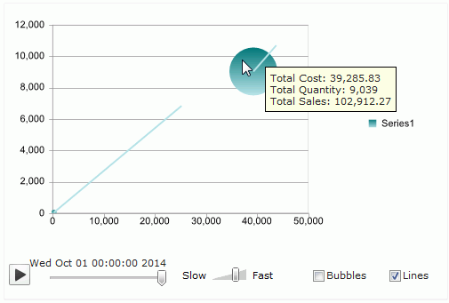
- Check the Lines checkbox, and click the play button, then the value of the motion field will change, and the bubbles in the chart will move based on the value change of the motion field in line trail. See the result below, when the value of the motion field is changed to 2014/10/01, the display value of the bubble also changes accordingly.

Note: To have a better and stable performance for motion charts, you are recommended to use the Google Chrome web browser.


 on the Insert toolbar.
