
A chart may contain the following axes (pie, indicator, heat map and org charts do not have axes), this section introduces how to format each axis in detail:
To format the category axis of a chart, take the following steps:
In the Option box, specify whether to show gridlines perpendicular to the axis, and if necessary, check Show Gridlines. When creating a scatter chart or the axis is used to show numeric data of a bubble chart, you can also specify the maximum and minimum values to be displayed and the difference between two adjacent values on the axis, and the number of tick marks to be shown on the axis.
If you want to use a scrollbar to control the visible value range on the axis, check the Scrollable Chart option, then specify how many data items will be selected on the scrollbar and displayed on the axis by default, the percentage the scrollbar occupies the whole size of the chart, and whether to show the thumbnail chart in the scrollbar. It is available to 2-D charts of bar, bench, line, and area types in web reports and library components only. For details, see Creating a scrollable chart.
In the Line box, set the line color, style, transparency, and thickness of the axis.
In the Gap box, set the gap between the labels and the axis, and check Best Effect to draw the axis labels for the best result effect.
In the Type box, specify whether to show the tick marks and their position which can be inside/outside the chart or across the axis.
In the Line box, specify the color, style, transparency and thickness of the tick marks. If you want to use the same line setting as that of the axis for the tick marks, check Correlate with Axis. Then specify the length of the tick marks.
In the Option box, specify whether to show the tick mark labels. When the tick mark labels are shown on the axis, you can control the frequency at which the tick marks will be labeled, whether to display the complete label text when the mouse pointer points at a label on the axis, and the number of the tick mark labels to be displayed on the axis.
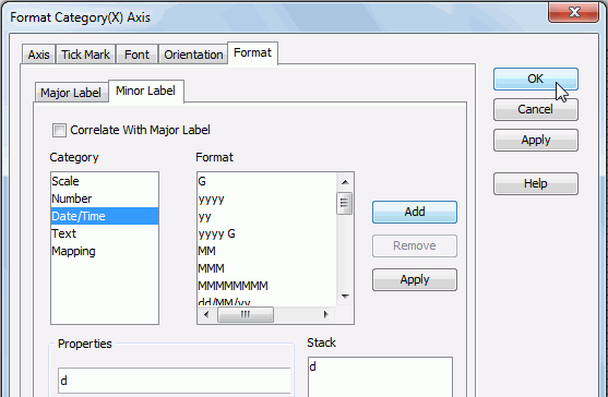
Select a category from the Category box, then select a format from the Format box and click Add to add it to the Stack box. If the formats listed in the Format box cannot meet your requirement, define the format in the Properties text field and click Add to add it as the format of the selected category. You can add more than one format, while for each category, only one format can be added. In the event that a format is not necessary, select it in the Stack box click Remove to clear it.
To make the minor tick mark labels apply the format setting of the major tick marks, check Correlate with Major Label in the Minor Label sub tab.
 that appears in the text box to open the Web Action List dialog, where you can bind a web action to the axis which will be triggered when the specified event occurs on the axis.
To add a web behavior line, click  , and if a web behavior is not required, click
  to remove it.
Click  or
or  to adjust the order of the behaviors. Then, when an event that has been bound with more than one action happens, the upper action will be triggered first.
The web actions you can bind to the axis include Filter, Sort, Parameter, Property and SendMessage. For details about these web actions, refer to Applying web actions to a label.
See also the Format Category (X) Axis dialog for page report, web report, or library component for detailed explanation about options in the dialog.
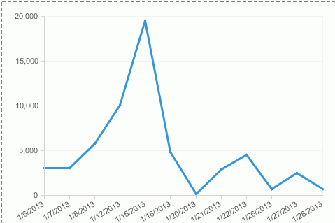
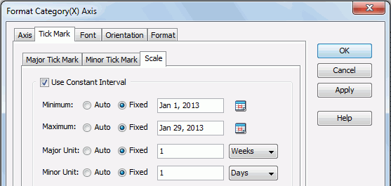
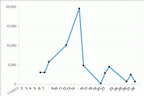
Time series data is data collected over time for a single or a group of variables. When using date series and time series values on the Category (X) axis it is often beneficial to see the chart with constant ranges rather than just what is in the data values. Missing values for weekends and holidays leaves gaps which distorts the chart and might lead to incorrect decisions. The following example shows how to use a constant interval to label time series data on the category axis:


Note: The tick marks for date vary based on the actual data values so each tick mark does not represent the same date range.
To format the value axis of a chart, take the following steps:
In the Option box, specify the maximum and minimum values to be displayed and the difference between two adjacent values on the axis, the number of tick marks to be shown on the axis, and whether or not to show the value labels on the axis in percent. If you want to show gridlines perpendicular to the axis, check Show Gridlines.
In the Line box, set the line color, style, transparency, and thickness of the axis.
In the Gap box, set the gap between the labels and the axis, and check Best Effect to draw the axis labels for the best result effect.
In the Type box, specify whether to show the tick marks and their position which can be inside/outside the chart or across the axis.
In the Line box, specify the color, style, transparency and thickness of the tick marks. If you want to use the same line setting as that of the axis for the tick marks, check Correlate with Axis. Then specify the length of the major/minor tick marks.
In the Option box (only available for minor tick marks), specify whether to show the major tick mark labels. When the major tick mark labels are shown on the axis, you can control the frequency at which the major tick marks will be labeled, whether to display the complete label text when the mouse pointer points at a label on the axis, and the number of the major tick mark labels to be displayed on the axis.
Select a category from the Category box, then select a format from the Format box and click Add to add it to the Stack box. If the formats listed in the Format box cannot meet your requirement, define the format in the Properties text field and click Add to add it as the format of the selected category. You can add more than one format, while for each category, only one format can be added. In the event that a format is not necessary, select it in the Stack box click Remove to clear it.
 that appears in the text box to open the Web Action List dialog, where you can bind a web action to the axis which will be triggered when the specified event occurs on the axis.
To add a web behavior line, click  , and if a web behavior is not required, click
  to remove it.
Click  or
or  to adjust the order of the behaviors. Then, when an event that has been bound with more than one action happens, the upper action will be triggered first.
The web actions you can bind to the axis include Filter, Sort, Parameter, Property and SendMessage. For details about these web actions, refer to Applying web actions to a label.
To format the series axis of a chart, take the following steps:
In the Option box, specify whether or not to only draw the axis (hide the labels), and if not, specify the number of labels to be shown along the axis, the frequency at which the axis will be labeled, whether or not to display the label text when the mouse pointer points at a label on the axis. If you want to show gridlines perpendicular to the axis, check Show Gridlines.
In the Line box, set the line color, style, transparency, and thickness of the axis.
In the Labels box, set the gap between the labels and the axis, and check Best Effect to draw the axis labels for the best result effect.
In the Tick Mark box, specify the color, style, transparency and thickness of the tick marks. If you want to use the same line setting as that of the axis for the tick marks, check Correlate with Axis.
In the Major Tick Mark and Minor Tick Mark boxes, set properties for the major and minor tick marks respectively, including whether to show these marks, the position, and length of the marks.
Select a category from the Category box, then select a format from the Format box and click Add to add it to the Stack box. If the formats listed in the Format box cannot meet your requirement, define the format in the Properties text field and click Add to add it as the format of the selected category. You can add more than one format, while for each category, only one format can be added. In the event that a format is not necessary, select it in the Stack box click Remove to clear it.
 that appears in the text box to open the Web Action List dialog, where you can bind a web action to the axis which will be triggered when the specified event occurs on the axis.
To add a web behavior line, click  , and if a web behavior is not required, click
  to remove it.
Click  or
or  to adjust the order of the behaviors. Then, when an event that has been bound with more than one action happens, the upper action will be triggered first.
The web actions you can bind to the axis include Filter, Sort, Parameter, Property and SendMessage. For details about these web actions, refer to Applying web actions to a label.