Adding conditional color fill to a chart
Usually, for a data marker in a chart, it uses a predefined color pattern assigned by JReport. However, by using the Conditional Color Fill feature, you can assign color patterns based on different value ranges. Thus, with the distinguishing colors, it is easy for you to locate the values you need to focus on in a chart.
There are two types of conditional color fill settings: Single Color with Condition and Multiple Colors with Condition. With a single color, you can make the data marker that meets the specified condition apply the color pattern bound with the condition. By using multiple colors, you can divide each data marker into different parts based on different value ranges along the direction of the value axis, and then specify different conditional colors to different value ranges.
Conditional color fill is only supported on bar, bench, pie, donut, area (Area 2-D and Area 3-D types), and 2-D line charts.
To adding conditional color fill to a chart:
- Double-click on any data marker (bar, bench, pie, donut, or line), and the corresponding format dialog is displayed.
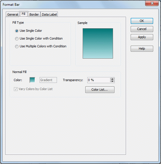
- Switch to the Fill tab (for line chart, to the Node tab). See a sample dialog.
- Select the fill type: Use Single Color with Condition or Use Multiple Colors with Condition. The fill type Use Multiple Colors with Condition is only supported on Clustered Bar/Bench 2-D, Clustered Bar/Bench 3-D, Bar/Bench 3-D, Area 2-D and Area 3-D chart types.
- If you select Use Single Color with Condition, you can edit the conditional fill with two modes (to switch between the two modes, click the Advanced or Normal button):
- Normal Mode
The procedure for editing conditional fill varies in normal mode according to the field on which the conditions will be based: category/series field or value field.
- If you want to define the conditions based on a category or series field:
- Select the category/series field from the Select Field drop-down list.
- Click
 to add a condition line, select a value from the Values drop-down list or input it directly in the text box to define the condition, then set the color and transparency for the value.
- Repeat the above step to add more conditional fill.
- The values beyond the ranges you have defined in all your conditions will automatically use the Other condition line. You can edit the color and transparency of the Other condition as well.
- By default, the condition expression of each condition line will be shown as the legend entry label. If you want to change it, select the condition line, check Label, and then change the label in the text box that follows.
- If you want to define the conditions based on a value field:
- Select the value field from the Select Field drop-down list.
- Click to add a condition line, specify the start value and end value for the condition by inputting the values directly in the text boxes, then set the color and transparency for the value range.
For 100% Stacked Bar/Bench 2-D chart, 100% Stacked Bar/Bench 3-D chart, 100% Stacked Line 2-D chart or pie/donut chart, you can control to display the data in the condition expression in percent. To achieve it, check Percent, and then input the percent value in decimal fraction in the Start Value and End Value column.
- Repeat the above step to add more conditional fill.
- The value beyond the ranges you have defined in all your conditions will automatically use the Other condition line. You can edit the color and transparency of the Other condition as well.
- By default, the condition expression of each condition line will be shown as the legend entry label. If you want to change it, select the condition line, check Label, and then change the label in the text box that follows.
- Advanced Mode
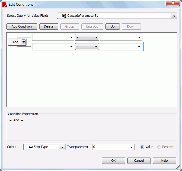
- Click
 to open the Edit Conditions dialog. See the dialog.
- From the Select Query for Value Field drop-down list, select the query which contains the fields the values of which you want to use to build the conditions.
- Click the Add Condition button to add a condition line, select a field used by the chart on which the condition is based from the field drop-down list, specify the operator with which to compose the condition, then select a field in the specified query from the value drop-down list as the value to build the condition.
For 100% Stacked Bar/Bench 2-D chart, 100% Stacked Bar/Bench 3-D chart, 100% Stacked Line 2-D chart or pie/donut chart, if you select a value field from the Field drop-down list, you can control whether to display the data in the condition expression as value or in percent by checking Value or Percent.
- Select the fields in the specified query from the Color and Transparency drop-down lists to control the color and transparency for the condition. Note that the values of the field you select to control color should contain string such as 0x000000, and the values of the field used to control transparency should be integer between 0 and 100. If the given fields cannot meet your requirement, click <Input...> and then input the value directly in the text box.
- Repeat the above steps to add more conditions if necessary.
To make some conditions grouped, select them and click the Group button, then the selected conditions will be added in one group and work as one line of filter expression. Conditions and groups together can be further grouped. To take any condition or group in a group out, select it and click Ungroup.
To adjust the priority of the conditions, select it and click the Up or Down button.
To delete a condition line, select it and click the Delete button.
- When done, click OK. The condition specified in the Edit Conditions dialog will be listed as a new condition line in the Conditional Fill box in the chart formatting dialog. Click if you want to further edit the condition.
- The value beyond the ranges you have defined in all your conditions will automatically use the Other condition line. You can edit the color and transparency of the Other condition as well.
- By default, the condition expression of the condition line will be shown as the legend entry label. If you want to change it, select the condition line, check Label, and then change the label in the text box that follows.
If you select Use Multiple Colors with Condition, click button to add a condition line. Specify the start value and end value for the condition by inputting the values directly in the text boxes, then set the color and transparency for the value range. Click to add another condition and define the color pattern for it. The value beyond the ranges you have defined in all your conditions will automatically use color pattern defined in the Other condition line. By default, the condition expression of the condition line will be shown as the legend entry label. If you want to change it, select the condition line, check Label, and then change the label in the text box that follows.
- When done, click OK to accept the settings and close the dialog.
Examples of adding conditional color fill to a chart
The following examples illustrate how to add conditional color fill to a chart.
Using the Use Single Color with Condition fill type
- Open the catalog file SampleReports.cat.
- Click File > New > Page Report on the menu bar. Select Chart in the New Page Report dialog and click OK to bring out the Chart Wizard.
- In the Data screen of the wizard, select the query WorldWideSales from Data Source 1. Then click Next.
- Select Clustered Pie type in the Type screen.
- In the Display screen, add the field City to the Category box, then click the Order/Select N button. In the Category Options dialog, select Top N from the Select drop-down list, input 12 in the text field to the right, then click OK to return to the wizard. Add the field Sum_TotalSalesbyCity to the Show Values box.
- Skip the Filter, Layout and Style screen, click Finish to create the chart.
- Save the report and click the View tab, the report will show as follows:

- Go back to the design mode and double-click a pie in the chart. The Format Pie dialog will be displayed.
- Go to the Fill tab and select Use Single Color with Condition. From the Select Field drop-down list, select [Category]City, then click the add button three times to add three condition lines, and specify the conditions and related colors as follows:

- Click OK to apply the settings and close the dialog.
- View the report again. Now you can see pie sections standing for the city Almaty, Brussels and Beijing are filled with the defined color for distinguishing, and other cities are all be distributed to the Other group.

Next, we will use percentage values to edit the condition expressions.
- Go back to the design mode and enter the Format Pie dialog again.
- Select Use Single Color with Condition again in the Fill tab, then select [Value]Sum_TotalSalesbyCity from the Select Field drop-down list. Check the Percent radio button, and click to add a new condition line. Set the start value to 0.04, and the end value to 0.06, and then input 00CCFF in the Color text field. Check the Label checkbox, then modify the condition expression to 4% <= TotalSales < 6%. Specify the color for the Other group to FFFF99. Click OK to accept the settings. View the report and the result looks like:

- From the report above, you can see the Other group and all the pie sections whose values are between 4% and 6% of the total value are filled with the defined colors. To make the result more clear, you can specify to display the value label of the pies in percent by setting the property Value Label Type of the chart paper to percent in the Report Inspector. Then the report result is shown as follows:

Using the Use Multiple Colors with Condition fill type
- Open the catalog file SampleReports.cat, and create a clustered bar 2-D chart using the same query, category/value field and the Select N condition with the pie chart above. View the report and it looks like as follows:

- Double-click a bar in the chart to display the Format Bar dialog.
- In the Fill tab, select Use Multiple Colors with Condition as the fill type, then the value field Sum_TotalSalesbyCity will be the selected by default in the Select Field drop-down list. Click four times to add four condition lines, then specify the conditions and the colors as follows:

- By default, the condition expression will be used as the legend entry label. Take the first condition line as example, its condition expression is 10000 <= Sum_TotalSalesbyCity < 20000, which is not very intuitive. To change it, select the condition line, check the Label checkbox, then change the expression to 10000 <= TotalSales < 20000 in the Label text field. Make the similar changes to all the condition lines and click the OK button.
- Save the report and click the View tab, the result will be displayed as follows. Each bar is divided into several parts based on different value ranges with different conditional colors.