

Lesson 1: Creating and working with web reports
End users can create web reports on JReport Server if a business view is available. In this lesson, we will create a web report as an end user. The report should contain a table, a crosstab, and a chart.
This lesson contains the following tasks:
Task 1: Create a web report
- On the JReport Console > Resources page, go to the Public Reports folder, then click New > Report on the task bar.

- In the Select Report Type dialog, select Web Report and click OK.
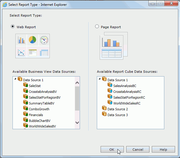
The Web Report Wizard appears.
- In the Page screen of the wizard, select Template2, which allows for company log, company name, report titles to be defined and added in the report's page header panel. We will keep the current company logo and titles, and just change the report titles. In the Report Title text field, input Sales Performance. Leave the Sub Title text field blank.
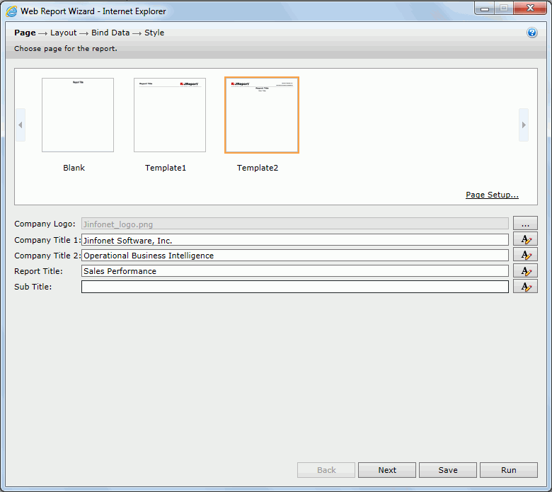
Click Next in the Web Report Wizard to go to the Layout screen.
- In the Layout screen, select the T-Style layout. In the first tabular row, click the Click here to select component link in the left cell, select Crosstab from the drop-down menu, select Chart for the right cell. For the bottom cell, select Table from the drop-down menu.
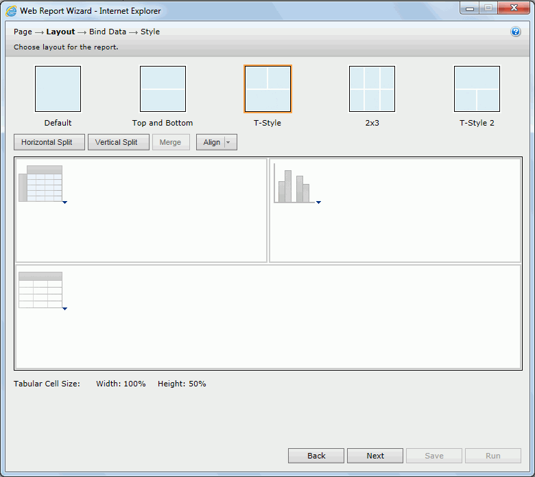
- Click Next to go to the Bind Data screen to define data for the three components one by one. We will make the three components use the same business view. From the Data Source drop-down list, select WorldWideSalesBV in Data Source 1.
- First define the crosstab. Add Region to the Columns box, Sales Month to the Rows box, and Total Sales to the Summaries box.
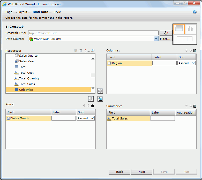
- Click Next to define the chart.
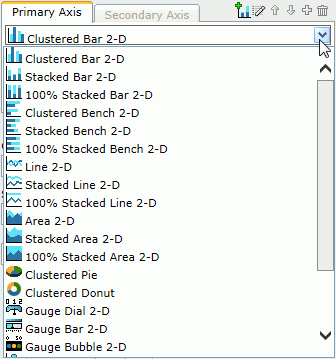
In the Show Values box, the default chart type is Clustered Bar 2-D, you can change it by selecting another type from the drop-down list.
Here we use the default type.
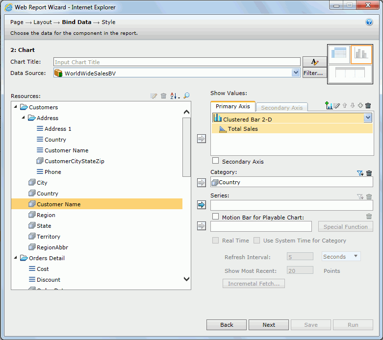
Add Total Sales to the Show Values box and the group element Country to the Category box.
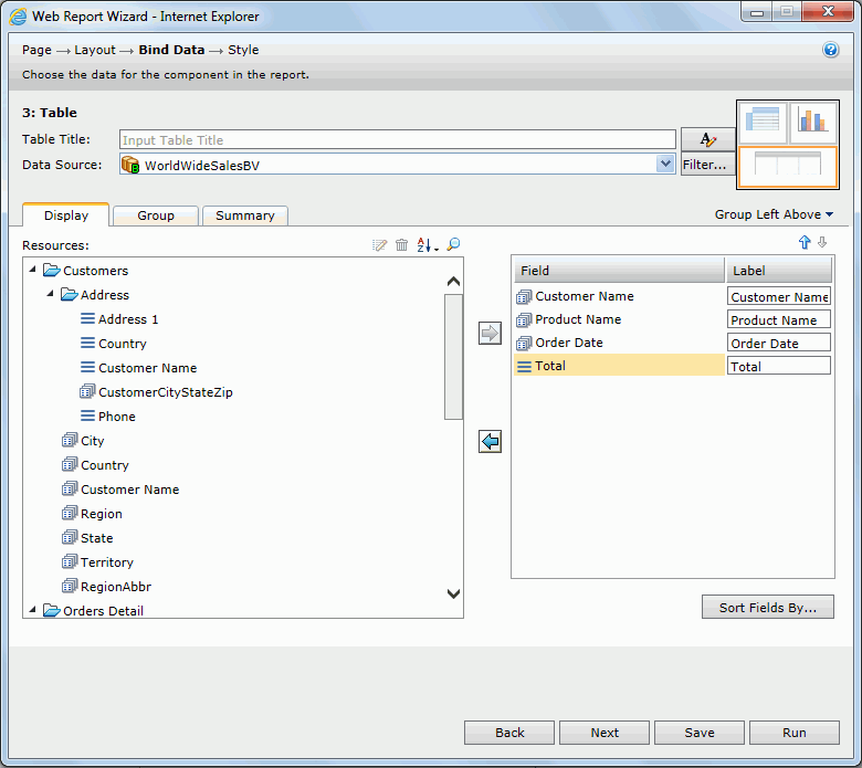
- Click Next to define the table. In the Display tab, add these fields: the group element Customer Name, Product Name, Order Date, and Total. In the Group tab, add Country as the group by field.
- Click Next to display the Style screen and select Neutral as the style.
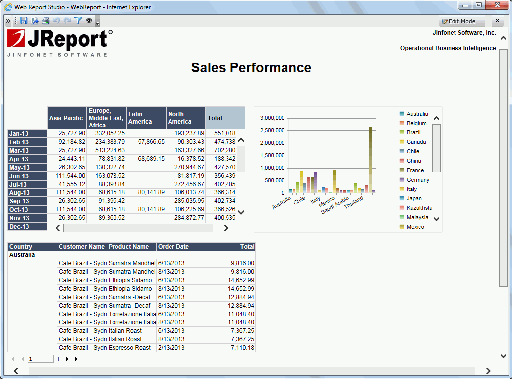
- Click Run and the report is opened in Web Report Studio.
- Click the Save button
 on the toolbar.
- In the Save As dialog, type Sales Performance in the File Name text field, then click OK to save the web report. In the prompt message window, click OK.
Task 2: Operate on the crosstab
- By default it is view mode for the report. To analyze the report data, click Edit Mode on the toolbar.
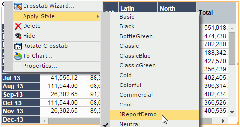
- First we change the style of the crosstab. Click anywhere on the crosstab, when the icon
 appears at its upper top left, right-click the icon, then select Apply Style > JReportDemo from the shortcut menu.
-
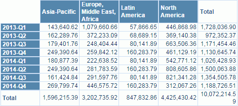
We will change the data view from Sales Month to Sales Quarter in the row headers. Right-click the row header which displays months, select Switch Row > Sales Quarter from the shortcut menu. The row header now displays quarters.
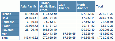
- To further view information about the product category in the first quarter of 2013, right-click 2013-Q1 in the row header, select Go to by Value > Category from the shortcut menu. The crosstab now shows the total sales of the product categories in the first quarter of 2013 in different regions.
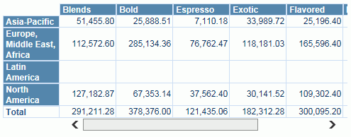
- The row and column headers can be switched. Click anywhere on the crosstab, when the icon
 appears at its upper top left, right-click the icon, then select Rotate Crosstab from the shortcut menu.
- Click
 on the toolbar to undo the rotation.
- We will convert the crosstab to a chart. Click anywhere on the crosstab, when the icon
 appears at its upper top left, right-click the icon, then select To Chart from the shortcut menu.
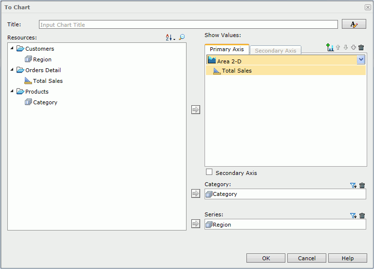
- In the To Chart dialog, the data fields used in the crosstab are listed. We need to define our chart based on these fields. In the Show Values box, from the chart type drop-down list where Clustered Bar 2-D is shown, select
Area 2-D.
Then add the data fields as follows:
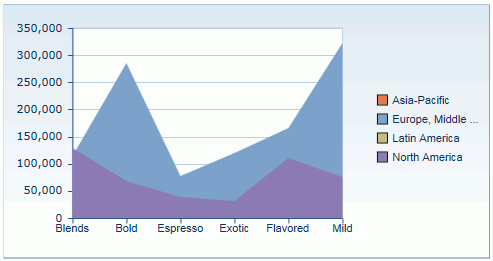
- Click OK. Here is the chart:
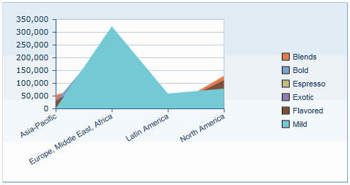
- To switch the category and the series, right-click on the chart and select Swap Chart Groups.
- Click
 on the toolbar to save the report.
Task 3: Perform on the chart
- Point to the highest bar in the chart, the tip information shows the total sales. But it does not tell which country it is since it is difficult to figure out simply by the color.
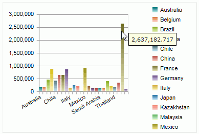
- We will make the tip show country information. Right-click on the chart and click Format Paper on the shortcut menu. In the Format Paper dialog, select Show Category and Series in the General tab, then click OK. The tip now displays as follows:
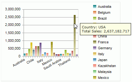
We can easily see that the USA is the company's biggest market.
We will link the values to a table which contains detailed information about the values.
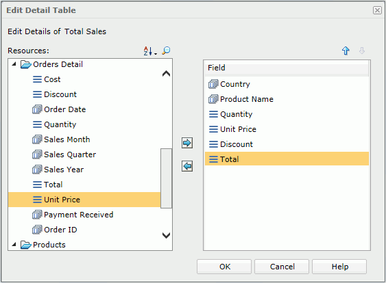
- Right-click on a bar, select Edit Detail Table. In the Edit Detail Table dialog, add these fields to the right panel concerning the total sales in the countries: Country, Product Name, Quantity, Unit Price, Discount, and Total, then click OK.
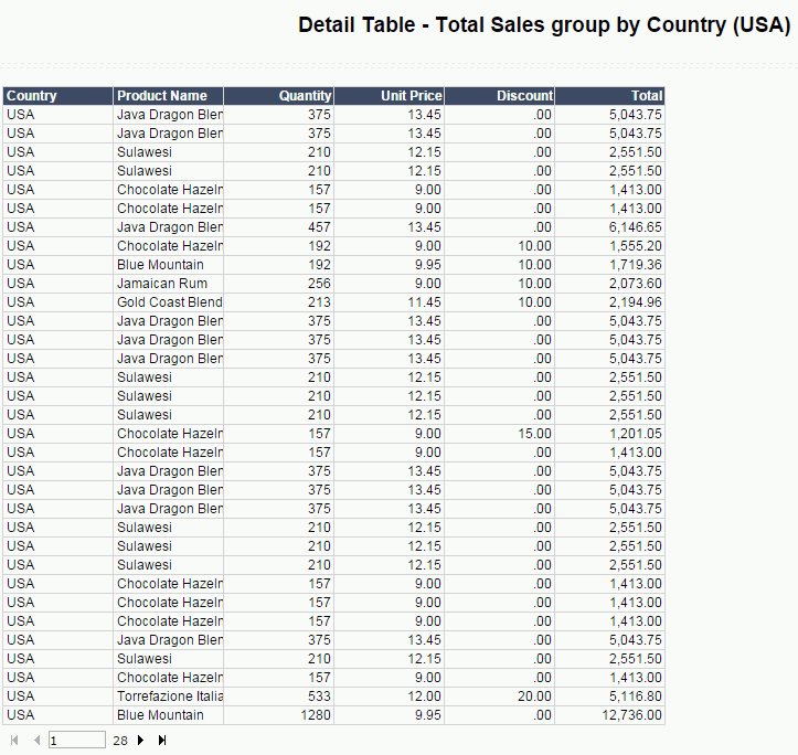
- Now we can view the details about the chart values. Right-click on the bar representing USA and click Go to Detail on the shortcut menu. The following table will be displayed showing information about the USA.
- Click
 on the toolbar to return to the main report.
- Since the business view has defined hierarchy, we can go through data upward and downward directly. Right-click any country name on the X axis and select Go Up > Region.
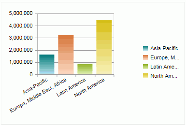
- Now we go down from Region to Country, it is not a reversed process of going up from Country to Region, but applying an additional filter. Right-click North America on the X axis and select Go Down > Country.
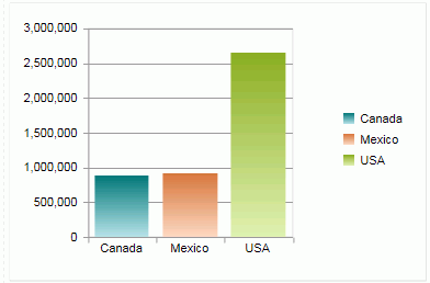
The chart shows the countries in the North America instead of all the countries.
- Click
 on the toolbar to save the report.
Task 4: Work with the table
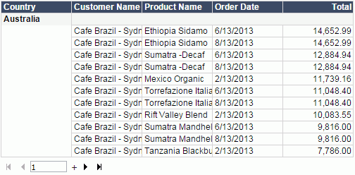
- We first sort the Total column in descending order. Right-click any value in the Total column and then select Sort > Descend from the shortcut menu.
- Next we summarize the total sales for each country group and for all the countries.
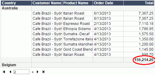
Right-click any value in the Total column, then select Aggregate On from the shortcut menu. In the Aggregate On dialog, set Function to Sum, then click OK. You will see the total sales for each country group is added at the end of each group and the total sales for all the countries is added at the end of the table.
This operation also creates a dynamic aggregation which is given a default name Sum_Total. You can find it in the Dynamic Resource > Aggregations list in the Resources panel and you can use it again in the report.
The sum of total for Australia:
The sum of total for all the countries:

We will link the table to another report.
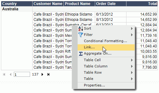
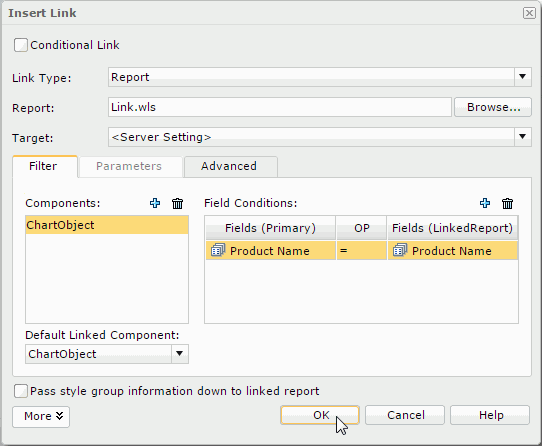
- Go back to the first page of the table. Right-click on any Product Name value and select Link from the shortcut menu.
- In the Insert Link dialog, click Browse to select Link.wls in the Public Reports folder. Click OK.
- Click More to show more settings. In the Filter tab, click
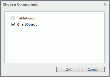
 above the Components box. In the Choose Component dialog, select ChartObject in the linked report as the link target and click OK.
- Set up a relationship between the table and the target chart in the Field Conditions box. Click the button
 above the Field Conditions box to add a new condition row. Set the condition as Product Name = Product Name.
- Click OK to apply the settings.
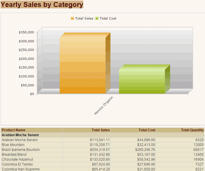
- Click Mexico Organic in the Product Name column of the table. The link.wls report will be displayed with the chart filtered to show only data about Mexico Organic.
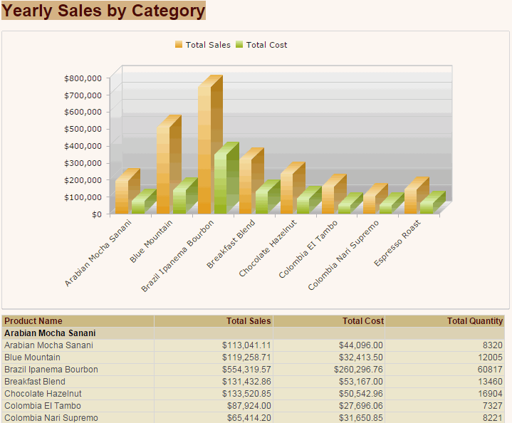
The following is the original link.wls for comparison:
- Click
 on the toolbar to save the report.
Task 5: Apply a filter
The three data components in the report use the same business view, therefore we can apply filters to them at the same time. There are two tools to use: the Filter panel and filter controls. For the usage of filter controls, you can learn from Creating a web report using JReport Designer. Here we focus on using the Filter panel to dynamically filter report data.
We would like to filter data with product categories, so we need to add the Category field to the Filter panel.
- Expand the Filter panel on the left. Click + on the title bar of the Filter panel, then in the Select Field dialog, select Category and click OK. The Category field will be added in the Filter panel with its values.
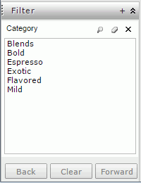
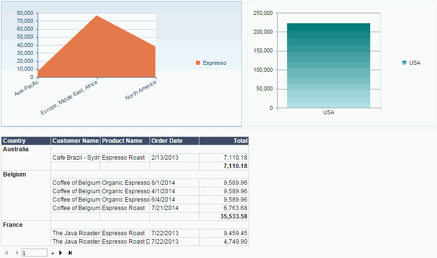
- Click Espresso in the Category box. The report comes out as follows:
- Click
 on the toolbar to save the report.
Lesson 1 summary
In this lesson, we created a web report containing a table, a crosstab, and a chart from the view of an end user on JReport Server, performed several actions on the data components, and used the Filter panel to filter the desired data. The report
template was then saved in the server version system and can be uploaded to
JReport Designer to make more advanced changes to it if desired.


 on the toolbar.
  appears at its upper top left, right-click the icon, then select Apply Style > JReportDemo from the shortcut menu.


 appears at its upper top left, right-click the icon, then select Rotate Crosstab from the shortcut menu.

 on the toolbar to undo the rotation.
  appears at its upper top left, right-click the icon, then select To Chart from the shortcut menu.


 on the toolbar to save the report.


 on the toolbar to return to the main report.

 on the toolbar to save the report.


 above the Components box. In the Choose Component dialog, select ChartObject in the linked report as the link target and click OK.

 above the Field Conditions box to add a new condition row. Set the condition as Product Name = Product Name.


 on the toolbar to save the report.

 on the toolbar to save the report.